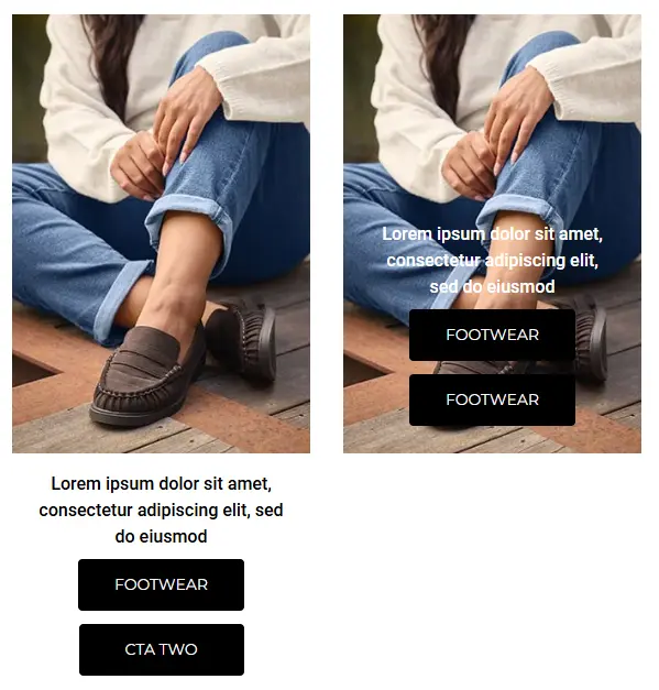
Custom Banner V3 Component
The Custom Banner V3 component allows the user to add a custom image or video banner on any CMS page. This component has many more customisation options than the regular Custom Banner.
Adding a Custom Banner V3 Component
Go to the Components tab (second tab) on the right side of the screen and click on the Custom dropdown
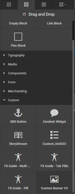
Drag the component called *Custom Banner V3 onto the page where you want the custom banner to appear.
Settings
Add text elements, cta/buttons and choose your banner type.
❗= leave blank to remove the element
HeadingElement - this is where you can change the element that wraps around the Heading element
LinkAround - dropdown selector to add an anchor tag element around the video/image
BannerType - select the type of banner you wish to show, this defaults as image but you can change to video
BannerTextType - choose inside for text over/inside the image video and below to display the text underneath
SubHeading - the text you wish to add with the Sub Heading ❗
SubHeadingExtraClass - add any extra classes you wish to add for the Sub Heading element
Heading - the text for you heading ❗
Intro Text - the intro text for your banner ❗
Cta Text - the text for your first CTA Button ❗
Cta URL - the URL for your first CTA Button
Cta Button Style - dropdown with all the usual btn classes, will default to none, but if you want to use custom colours you should leave this as none.
CtaExtraStyle - any extra classes you with to add to first CTA
CtaBackground - a colour picker for the custom background colour of your first CTA Button (hover effect will change this to the CtaColour Colour)
CtaBorderRadius - input the size of the first CTA border radious for rounded corners
CtaColour - a colour picker for the custom text colour of your first CTA Button (hover effect will change this to the CtaBackground Colour)
CtaTextTwo - the text for your second CTA Button ❗
CtaUrlTwo - the URL for your second CTA Button
CtaButtonStyleTwo - dropdown with all the usual btn classes, will default to none, but if you want to use custom colours you should leave this as none.
CtaExtraStyleTwo - any extra classes you with to add to second CTA
CtaBackgroundTwo - a colour picker for the custom background colour of your second CTA Button (hover effect will change this to the CtaColour Colour)
CtaBorderRadiusTwo - input the size of the second CTA border radious for rounded corners
CtaColourTwo - a colour picker for the custom text colour of your second CTA Button (hover effect will change this to the CtaBackground Colour)
ShowCtaStacked - boolean dropdown defaults to false, this controls whether the CTA's are stacked

General
Add class, style & id to the outer container.
Selectors - add classes to the outer container
Styles - add styles to the outer container
Id - add id to the outer container
Typography
Control the font family, font size & text colour. If you do not edit these the standard CSS will be used.
SubHeadingFontFamily - sub heading font family
SubHeadingFontSize - sub heading font size
SubHeadingColour - sub heading text colour
HeadingFontFamily - heading font family
HeadingFontSize - heading font size
HeadingColour - heading text colour
IntroFontFamily - intro font family
IntroFontSize - intro font size
IntroColour - intro text colour
CtaFontFamily - cta font family
Extra
Text position & style.
Vertical Alignment - control the vertical alignment of the text area on the video/image
Horizontal Alignment - control the horizontal alignment of the text area on the video/image
Vertical & horizontal alignment can be combined to achieve 9 positions (text alignment will match the vertical setting):
Top Left - Top Center - Top Right
Middle Left - Middle Center - Middle Right
Bottom Left - Bottom Center - Bottom Right
Text Style - color of text
SubHeadingMargin - change between standard of large margin
Advanced
This section is mostly related to media items.
If you're using an image/video you should provide an image/video for each of the breakpoints and make sure to add all the correct heights and widths. Failing to do this will result in poor performance and content layout shifts.
Breakpoints
Mobile = 0px - 767px
Tablet = 768px - 991px
Desktop = 992px and up
AltTag - the alt tag that describes the image
DesktopImage - either upload or load an image to show on desktop devices
DesktopImageHeight - enter the height of the image
DesktopImageWidth - enter the width of the image
TabletImage - either upload or load an image to show on table devices
TabletImageHeight - enter the height of the image
TabletImageWidth - enter the width of the image
MobileImage - either upload or load an image to show on mobile devices
MobileImageHeight - enter the height of the image
MobileImageWidth - enter the width of the image
VideoDesktop - video you want to show on desktop devices
VideoDesktopPoster - video poster that shows before the video has loaded on desktop devices
DesktopVideoHeight - enter the height of the desktop video
DesktopVideoWidth - enter the width of the desktop video
VideoTablet - video you want to show on tablet let devices
VideoTabletPoster - video poster that shows before the video has loaded on tablet devices
TabletVideoHeight - enter the height of the tablet video
TabletVideoWidth - enter the width of the tablet video
VideoMobile - video you want to show on mobile devices
VideoMobilePoster - video poster that shows before the video has loaded on mobile devices
MobileVideoHeight - enter the height of the mobile video
MobileVideoWidth - enter the width of the mobile video