Shop By Size
The Shop By Size Component allows the user to add a custom image or video banner on any CMS page. This component has many more customisation options than the regular Custom Banner.
Adding a Shop By Size Component
Go to the Components tab (second tab) on the right side of the screen and click on the Custom dropdown
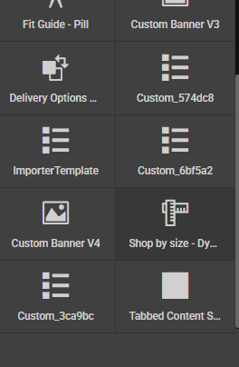
Drag the component called *Shop by size - Dynamic onto the page where you want the custom banner to appear.
This will give you the basic component with some placeholder text.

Edit the settings below to adjust the component.
Settings
Id - add an id to the outer container
Class - add an classes to the outer container
Style - add an inline styles to the outer container
Settings
Sizes - add a comma seperated list of all the size links you wish to add e.g. 8, 10, 12
BaseUrl - add the base url that needs to go in front of the above sizes (this will combine with the above to create the urls for each size, for example if your base url is '/clothing' with the first size above the url would become '/clothing/size-8')
BackgroundColour - add a background colour to the outer container
SizeBorderColour - this changes the colour of the size guide button border
SizeBorderRadius - adjust the border radius for the size guide buttons, as default it will be 50% but will work with values such as '5px / 5%' etc
SizeBackgroundColour - adjust the background colour of the size buttons
ComponentBgImageUrl - add an image to the background of the container for desktop, the container should expand to the size of the image and the content will be positioned centrally
ComponentBgImageMobileUrl - add an image to the background of the container for desktop, the container should expand to the size of the image and the content will be positioned centrally
Typography
TitleText - adjust the title text that displays on the same row when space on larger devices and will be above the buttons on smaller devices
TitleFontSize - adjust the font size for the title
TitleFontFamily - use the dropdown to change the font family
TitleFontWeight - add a value such as 700 to make the font bold
TitleFontColour - use the colour picker to change the title text colour
SizeTextColour - use the colour picker to change the size button text colour