Tabbed Content Section
The Tabbed Content Section Component allows the user to add a tabbed content section to any page and provide custom button text & content to each tabbed panel.
Adding a Tabbed Content Section Component
Go to the Components tab (second tab) on the right side of the screen and click on the Custom dropdown
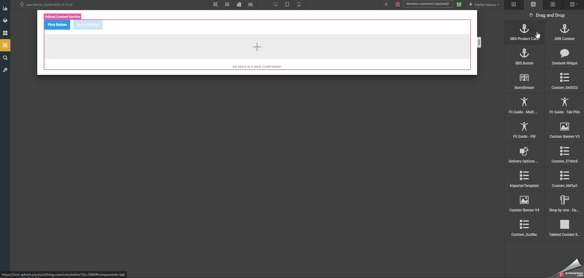
Drag the component called Tabbed Section Component onto the page where you want the Tabbed Content Section to appear.
Add in the amount of buttons/panels you require and the text for each button using Items & ButtonLabels from the settings below.
Clicking on the relevant buttons will show you the droppoints for the content you wish to show in each panel.
Settings - General
Add class, style & id to the outer container.
Id - add id to the outer container
Class - add css classes to the outer container
Styles - add styles to the outer container
ButtonContainerClass - add classes to the button container where the tab buttons are housed

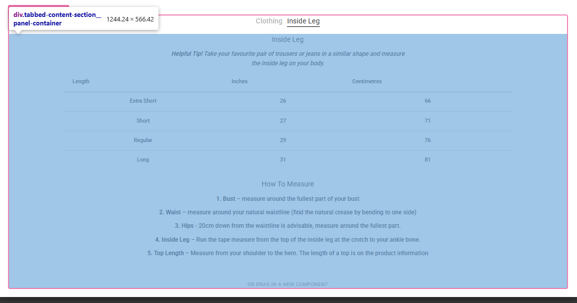
PanelContainerClass - add classes to the pannel container where the tab panels are housed
Settings - Advanced
Items - The number of tabbed sections
ButtonLabels - This is the area to add your button labels and should match the item amount above. For this input you need to provide the button text for each button as a comma seperated string. E.g. button one, button two, button three
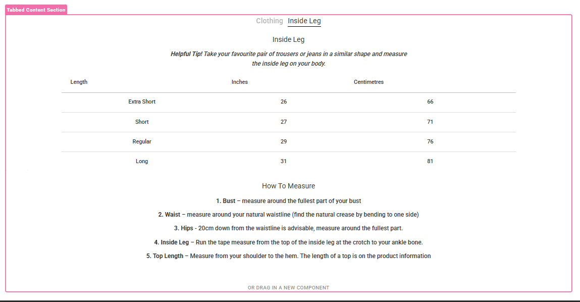
PanelType - Select the type of Tabbed Content Section you wish to use
Default option will display the buttons as btn-primary and will be aligned left.
Size Guide option will display the buttons as regular text links in the format requested by Charlotte Boon.